Fluid property plots
2026-04-02
The pressure-enthalpy diagram is a map of thermodynamics. A cartographic artefact through which fluid engineers tease out the lay of the land of the world that they inhabit.
I read Tom Schachtman’s wonderful book “Absolute Cold” about the history of cryogenics and it documented humanity’s valiant efforts at understanding how fluids behave at low temperatures. In reading the book, I had this feeling of the engineers and physicists going on a scouting mission, slowly uncovering a video-game ‘fog of war’ existing over fluid behaviour. What happens when you liquefy Oxygen, or Nitrogen? What happens when Helium is made cold? How do these fluids behave in those regimes? The book was a treat.
The work pioneered by people like Kelvin, Dewar and Kamerlingh Onnes allows these properties to be calculated trivially. Refprop or Coolprop will do it easily these days. In CoolProp, you can even get arbitrary partial derivatives of thermodynamic variables.
Here, I want to enable you to be able to make such maps for essentially any pure fluid that’s available in CoolProp and Refprop. Let’s get started.
To work with a concrete example, we will start by making a pressure-enthalpy diagram. Other diagrams are possible (and discussed here), but sticking to a concrete example makes my writing task easier. In the same spirit, we will start with Python first, and then we’ll add the other programming languages. We will also stick to CO2, a fluid I know intimately, before looking at other variables.
An important point to note here is that the comparison I mentioned above between the map of a terrain and the map of fluid properties isn’t just semantic either. The fluid property diagrams are literally contour plots of the region. There are crisscrossing contour lines topographically depicting densities, temperatures, entropies, internal energies, vapour qualities, void fractions and any other variable you desire. It is quite literally a topographical map. Our plots will therefore also be contour plots.
Here’s an example of the plot below:
The west side of the plot is the liquid phase, underneath the dome is the two-phase region, and east is the vapour region. Up north, above the dome, lies the supercritical region. I’ll point out here that to call a fluid supercritical, both the temperature and pressure must be above their critical values. In other words, the north-west region of the plot, where the temperature falls short of its critical value, is still liquid phase, even though it is above the critical pressure.
So, how to plot it?
Refprop and CoolProp both limit themselves to fluid properties. The following conditions: liquid, two-phase, vapour, and supercritical. Missing are properties for non-fluid states, that is: solid, melting, and sublimation phases. We start, thus, at the fully-melted line, and go until very high temperatures in vapour. In terms of we will limit ourselves to just-above the triple point, because lower is not available in these property routines.
Our procedure to plot the P-h diagram will be thus: We need an array of pressures and enthalpies. For each combination of those two, we need to calculate the properties we are interested in. For this article, those properties will be density, temperature, and (for two-phase) vapour quality. Then, we will use the Contour plotting libraries of the different programming languages to plot our diagram.
Our first task, then, is to define the domain, the terrain that we are mapping. What should be the extents of our plots? CoolProp makes available Pmax, Pmin, Tmax and Tmin. We could try to just use those extremes as our domain. But then we’d end up with a plot like this:

Very complete, sure, but not that useful, at least for me. One cannot see the two-phase dome at all, and the spacing is too loose. No, I’m interested in a region somewhere around the two-phase region. So, for this exercise, let’s say that I want to have the dome take up approximately half the frame, both in the x and y axes.
So, let’s set up the problem.
import numpy as np
import matplotlib.pyplot as plt
from CoolProp.CoolProp import PropsSI

fld = "CO2"

# Coolprop boundaries
P_max_cp = PropsSI("PMAX", fld)  # Max pressure available [Pa]
P_min_cp = PropsSI("PMIN", fld)  # Min pressure available [Pa]
T_max_cp = PropsSI("TMAX", fld)  # Max temperature available [K]
T_min_cp = PropsSI("TMIN", fld)  # Min temperature available [K]
P_crit = PropsSI("PCRIT", fld)  # Critical pressure [Pa]
P_trip = PropsSI("PTRIPLE", fld)  # Triple-point pressure [Pa]
T_crit = PropsSI("TCRIT", fld)  # Critical temperature [K]
T_trip = PropsSI("TTRIPLE", fld)  # Triple-point temperature [K]
Here we’ve calculated the limits allowed by CoolProp. Now we can define our domain:
# Calculate limit enthalpies
h_min = PropsSI("H", "P", P_min_cp, "T", T_min_cp, fld)
h_crit = PropsSI("H", "P", P_crit, "T", T_crit, fld)
h_max = h_crit * 2
P_min = P_min_cp
P_max = P_crit * 2
Roughly speaking, twice the critical enthalpy and pressure should do it.
Next, we need to calculate the following properties for our example:
- Saturated liquid line
- Saturated vapour line
- Vapour qualities
- Densities
- Temperatures
The first two are not contour lines. They are simply x-y line plots of pressure and enthalpy. And the first three are all valid for only the subcritical range, so we need to split up our pressures into sub- and super-critical domains.
Now, splitting a domain can be done in two ways. I could use
linspace wherein I define the number of
steps I want, and the stepsize between steps is calculated
thereby, or I could use arange, a stupid name, but
something wherein I define the step I want to take, and
the array sizes will be whatever they will be. I prefer the latter
way because I want granular control of the step-size. Here are
some sample values:
# Establish the plot domain
p_step = 0.1  # [bar]
P_SUB = np.arange(P_min, P_crit, p_step * 1e5)
P_SUP = np.arange(P_crit, P_max, p_step * 1e5)
m_sub = len(P_SUB)
m_sup = len(P_SUP)
m = m_sub + m_sup
P = np.concatenate((P_SUB, P_SUP))
h_step = 10  # [kJ/kg]
H = np.arange(h_min, h_max, h_step * 1e3)
n = len(H)
Now we have our arrays of Pressure and Enthalpy. Let us now calculate the saturation lines.
# Calculate saturation lines
H_LIQ = np.zeros(m_sub)
H_VAP = np.zeros(m_sub)
for i in range(m_sub):
    H_LIQ[i] = PropsSI("H", "P", P_SUB[i], "Q", 0, fld)
    H_VAP[i] = PropsSI("H", "P", P_SUB[i], "Q", 1, fld)
Next the vapour qualities:
# Calculate vapour qualities
x_vals = np.arange(0.1, 1, 0.1)  # Steps of 10%
VQ = np.zeros((m_sub, len(x_vals)))
for i in range(m_sub):
    for j in range(len(x_vals)):
        VQ[i, j] = PropsSI("H", "P", P_SUB[i], "Q", x_vals[j], fld)
Finally, we can calculate the densities and temperatures:
# Calculate densities and temperatures
D = np.zeros((m, n))
T = np.zeros((m, n))

for i in range(m):
    for j in range(n):
        D[i, j] = PropsSI("D", "P", P[i], "H", H[j], fld)
        T[i, j] = PropsSI("T", "P", P[i], "H", H[j], fld)
If you do it like this, though, you’ll end up with errors like below:
     70 for i in range(m):
     71     for j in range(n):
---> 72         D[i, j] = PropsSI("D", "P", P[i], "H", H[j], fld)
     73         T[i, j] = PropsSI("T", "P", P[i], "H", H[j], fld)
     75 H_PLT, P_PLT = np.meshgrid(H, P)

File CoolProp/CoolProp.pyx:491, in CoolProp.CoolProp.PropsSI()

File CoolProp/CoolProp.pyx:571, in CoolProp.CoolProp.PropsSI()

File CoolProp/CoolProp.pyx:458, in CoolProp.CoolProp.__Props_err2()

ValueError: unable to solve 1phase PY flash with Tmin=216.593, Tmax=217.033 due to error: HSU_P_flash_singlephase_Brent could not find a solution because Hmolar [3522.35 J/mol] is below the minimum value of 3522.56966774 J/mol : PropsSI("D","P",527964.3434,"H",80035.52609,"CO2")
We need some exception handling. We will rely on the fact that matplotlib (as with most plotting libraries these days) can handle NaN (Not a Number) values very smoothly. We make the code slightly more robust, and while we’re at it, let’s print some stuff so we know where we are too:
# Calculate densities and temperatures
count = 1
total_points = m * n

D = np.zeros((m, n))
T = np.zeros((m, n))

for i in range(m):
    print(f"{count/total_points*100}% done")
    for j in range(n):
        try:
            D[i, j] = PropsSI("D", "P", P[i], "H", H[j], fld)
        except:
            # Near the edges, we often have two-phase calculations failing.
            D[i, j] = np.nan
        try:
            T[i, j] = PropsSI("T", "P", P[i], "H", H[j], fld)
        except:
            T[i, j] = np.nan
        count += 1
A detour for some housekeeping
For reasons I cannot fathom, both matlab and numpy insist that the
X and Y variables of what you want to plot both be matrices of m×n
size, rather than X being a vector of size m and Y being a vector
of size n. So we need to use this thing called meshgrid, and then
we can make the plot:
H_PLT, P_PLT = np.meshgrid(H, P)Before we proceed, it is also a good idea to save the
results of our hard-won calculations. I don’t want to have to
re-do them each time I’m trying to tweak the plot a little bit.
I’ve added a flag called reread = False that wraps
all the code above and only runs it if I set the bool to True. If
it isn’t true, we simply read from an hdf5 file that we will store
our data to.
reread = True

if reread:

    # Calculate properties here
    # ...

    # Write to file
    output_file = f"{fld}_ph_props.h5"

    with h5py.File(output_file, "w") as f:
        f.create_dataset("P_PLT", data=P_PLT)
        f.create_dataset("H_PLT", data=H_PLT)
        f.create_dataset("P_SUB", data=P_SUB)
        f.create_dataset("H_LIQ", data=H_LIQ)
        f.create_dataset("H_VAP", data=H_VAP)
        f.create_dataset("VQ", data=VQ)
        f.create_dataset("x_vals", data=x_vals)
        f.create_dataset("T", data=T)
        f.create_dataset("D", data=D)

else:
    # Read from file
    file_name = f"{fld}_ph_props.h5"

    with h5py.File(file_name, "r") as f:
        P_PLT = f["P_PLT"][:]
        H_PLT = f["H_PLT"][:]
        P_SUB = f["P_SUB"][:]
        H_LIQ = f["H_LIQ"][:]
        H_VAP = f["H_VAP"][:]
        x_vals = f["x_vals"][:]
        VQ = f["VQ"][:]
        T = f["T"][:]
        D = f["D"][:]
Now we come to plotting the contour plot.
# Plot
plt.plot(H_LIQ / 1e3, P_SUB / 1e5, color="black", linewidth=2)
plt.plot(H_VAP / 1e3, P_SUB / 1e5, color="black", linewidth=2)
h = plt.contour(H_PLT / 1e3, P_PLT / 1e5, D, linewidths=1)
plt.clabel(h)
h = plt.contour(H_PLT / 1e3, P_PLT / 1e5, T-273.15, linewidths=1)
plt.clabel(h)
for i in range(len(x_vals)):
    plt.plot(VQ[:, i] / 1e3, P_SUB / 1e5, linestyle=":", color=[0.5, 0.5, 0.5])
plt.xlabel("Enthalpy [kJ/kg]")
plt.ylabel("Pressure [bar]")
Do all this, and you end up with what is below:

Pretty good, but there are a couple of issues here. First, the colourmap for the densities and temperatures aren’t immediately distinguishable. Next, sometimes we like to have the plot with a log-y scale (the so-called semi-log plot). There is also scope for more beautification. And lastly, the ‘staircase’ effect on the densities close to the liquid saturation line. I haven’t found a good solution to these that doesn’t involve taking more steps for the enthalpies than I have patience to tolerate. There is another way, but more on that later.
Here’s the code to change the first three, and the plot thereafter.
# Plot
fig, ax = plt.subplots()
ax.plot(H_LIQ / 1e3, P_SUB / 1e5, color="black", linewidth=2)
ax.plot(H_VAP / 1e3, P_SUB / 1e5, color="black", linewidth=2)
contours_D = ax.contour(H_PLT / 1e3, P_PLT / 1e5, D, cmap="copper_r", linewidths=0.75)
contours_T = ax.contour(H_PLT / 1e3, P_PLT / 1e5, T-273.15, cmap="winter", linewidths=0.75)
ax.clabel(contours_D, fmt="%d", fontsize=8, inline_spacing=0.01)
ax.clabel(contours_T, fmt="%d", fontsize=8, inline_spacing=0.01)

for i in range(len(x_vals)):
    ax.plot(VQ[:, i] / 1e3, P_SUB / 1e5, linestyle=":", color=[0.5, 0.5, 0.5])

ax.set_xlabel("Enthalpy [kJ/kg]")
ax.set_ylabel("Pressure [bar]")
ax.set_yscale("log")
Not so bad. I had difficulty finding two colourmaps that didn’t overlap with each other too much and also didn’t have the ‘light’ side of the values fading away so much that the text was hard to read against a white background.
Also note that here, we’ve created a new problem. Those y-axis labels. I hate them. I hate them so much I had to come up with a function to actually calculate the correct yticks so that we would read them in proper formats
Anyway, let’s try it different fluids. Here’s Krypton:

And now for C3F8 (known as R218 in CoolProp)

Maximum waviness! But this one is explained if you look at the pressures on the left. C3F8 is a low pressure fluid. Most of the action happens well below 1 bar, so our gradations are just too far apart.
Temperature-entropy plots
The method for temperature-entropy plots is similar to that for pressure-enthalpy, with some clever Find-and-Replace thrown in. Here’s the python code:
"""Temperature-entropy diagram for any fluid."""
import h5py
import numpy as np
import matplotlib.pyplot as plt
from CoolProp.CoolProp import PropsSI

fld = "CO2"

reread = True

if reread:
    # Coolprop boundaries
    P_max_cp = PropsSI("PMAX", fld)  # Max pressure available [Pa]
    P_min_cp = PropsSI("PMIN", fld)  # Min pressure available [Pa]
    T_max_cp = PropsSI("TMAX", fld)  # Max temperature available [K]
    T_min_cp = PropsSI("TMIN", fld)  # Min temperature available [K]
    P_crit = PropsSI("PCRIT", fld)  # Critical pressure [Pa]
    P_trip = PropsSI("PTRIPLE", fld)  # Triple-point pressure [Pa]
    T_crit = PropsSI("TCRIT", fld)  # Critical temperature [K]
    T_trip = PropsSI("TTRIPLE", fld)  # Triple-point temperature [K]

    # Calculate S domain
    s_min = 0 # PropsSI("S", "P", P_min_cp, "T", T_min_cp, fld)
    s_crit = PropsSI("S", "P", P_crit, "T", T_crit, fld)
    s_max = s_crit * 5
    s_step = 10
    S = np.arange(s_min, s_max, s_step)
    n = len(S)

    # Establish T domain
    T_min = T_min_cp
    T_max = 350  # Hard-coded for now.
    T_step = 1  # [K]
    T_SUB = np.arange(T_min, T_crit, T_step)
    T_SUP = np.arange(T_crit, T_max, T_step)
    m_sub = len(T_SUB)  # Number of points
    m_sup = len(T_SUP)  # Number of points
    m = m_sub + m_sup
    T = np.concatenate((T_SUB, T_SUP))

    # Calculate saturation lines
    S_LIQ = np.zeros(m_sub)
    S_VAP = np.zeros(m_sub)
    for i in range(m_sub):
        S_LIQ[i] = PropsSI("S", "T", T_SUB[i], "Q", 0, fld)
        S_VAP[i] = PropsSI("S", "T", T_SUB[i], "Q", 1, fld)

    # Calculate vapour qualities
    x_vals = np.arange(0.1, 1, 0.1)  # Steps of 10%
    VQ = np.zeros((m_sub, len(x_vals)))
    for i in range(m_sub):
        for j in range(len(x_vals)):
            VQ[i, j] = PropsSI("S", "T", T_SUB[i], "Q", x_vals[j], fld)

    # Calculate densities and temperatures
    count = 1
    total_points = m * n

    D = np.zeros((m, n))
    P = np.zeros((m, n))

    for i in range(m):
        print(f"{count/total_points*100:.1f}% done")
        for j in range(n):
            try:
                D[i, j] = PropsSI("D", "T", T[i], "S", S[j], fld)
            except:
                # Near the edges, we often have two-phase calculations failing.
                D[i, j] = np.nan
            try:
                P[i, j] = PropsSI("P", "T", T[i], "S", S[j], fld)
            except:
                P[i, j] = np.nan
            count += 1

    S_PLT, T_PLT = np.meshgrid(S, T)

    # Write to file
    output_file = f"{fld}_ts_props.h5"

    with h5py.File(output_file, "w") as f:
        f.create_dataset("T_PLT", data=T_PLT)
        f.create_dataset("S_PLT", data=S_PLT)
        f.create_dataset("T_SUB", data=T_SUB)
        f.create_dataset("S_LIQ", data=S_LIQ)
        f.create_dataset("S_VAP", data=S_VAP)
        f.create_dataset("VQ", data=VQ)
        f.create_dataset("x_vals", data=x_vals)
        f.create_dataset("P", data=P)
        f.create_dataset("D", data=D)

else:
    # Read from file
    file_name = f"{fld}_ts_props.h5"

    with h5py.File(file_name, "r") as f:
        T_PLT = f["T_PLT"][:]
        S_PLT = f["S_PLT"][:]
        T_SUB = f["T_SUB"][:]
        S_LIQ = f["S_LIQ"][:]
        S_VAP = f["S_VAP"][:]
        x_vals = f["x_vals"][:]
        VQ = f["VQ"][:]
        P = f["P"][:]
        D = f["D"][:]

# Plot

levels_p = np.arange(10, 110, 10)
levels_d = np.concatenate((np.arange(50, 100, 50), np.arange(100, 1700, 200)))

fig, ax = plt.subplots()
ax.plot(S_LIQ, T_SUB-273.15, color="black", linewidth=2)
ax.plot(S_VAP, T_SUB-273.15, color="black", linewidth=2)
contours_D = ax.contour(S_PLT, T_PLT-273.15, D, cmap="Greys_r", linewidths=0.5, levels=levels_d)
contours_P = ax.contour(S_PLT, T_PLT-273.15, P/1e5, cmap="jet", linewidths=0.5, levels=levels_p)
ax.clabel(contours_D, fmt="%d", fontsize=8, inline_spacing=0.01)
ax.clabel(contours_P, fmt="%d", fontsize=8, inline_spacing=0.01)

for i in range(len(x_vals)):
    ax.plot(VQ[:, i], T_SUB-273.15, linestyle=":", color=[0.5, 0.5, 0.5])

ax.set_xlabel("Entropy")
ax.set_ylabel("Temperature [°C]")
# ax.set_yscale("log")
And the end product:

There’s a little diamond on the far right of this image that I can’t seem to get rid off, but otherwise the plot is fit-for-purpose.
Non-contour plots
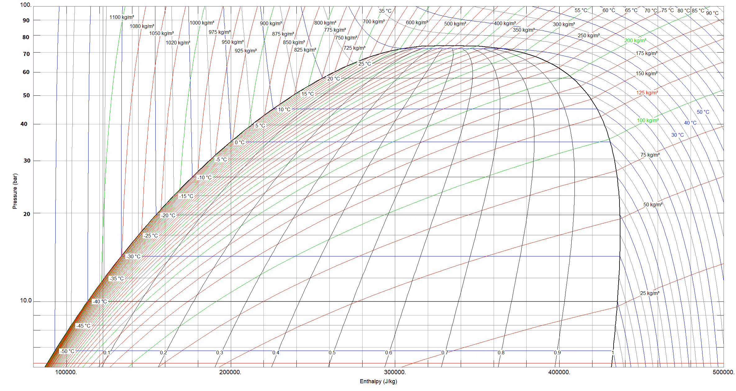
All the plots above are contour plots because that’s what made sense to me. The iso-property lines are contours, and that is what the contour plots are for. But, they do make life harder sometimes, as seen with the waviness. So as an alternative, here is a way of plotting that matches what my boss uses for his plots, wherein we take $P = f(h,\rho)$ or $P = f(h, T)$ to calculate the isochores and isotherms respectively.
Here is some illustrative code below
"""Pressure-enthalpy diagram for any fluid."""
import h5py
import numpy as np
import matplotlib.pyplot as plt
from CoolProp.CoolProp import PropsSI

fld = "CO2"

reread = True

if reread:

    # Coolprop boundaries
    P_min_cp = PropsSI("PMIN", fld)  # Min pressure available [Pa]
    T_min_cp = PropsSI("TMIN", fld)  # Min temperature available [K]
    P_crit = PropsSI("PCRIT", fld)  # Critical pressure [Pa]
    P_trip = PropsSI("PTRIPLE", fld)  # Triple-point pressure [Pa]
    T_crit = PropsSI("TCRIT", fld)  # Critical temperature [K]
    T_trip = PropsSI("TTRIPLE", fld)  # Triple-point temperature [K]

    # Enthalpy vector
    h_min = PropsSI("H", "P", P_min_cp, "T", T_min_cp, fld)
    h_crit = PropsSI("H", "P", P_crit, "T", T_crit, fld)
    h_max = h_crit * 2
    h_step = 2  # [kJ/kg]
    H = np.arange(h_min, h_max, h_step * 1e3)
    n = len(H)

    # Establish the plot domain
    P_min = P_min_cp
    P_max = P_crit * 2
    p_step = 0.05  # [bar]
    P_SUB = np.arange(P_min, P_crit, p_step * 1e5)
    P_SUP = np.arange(P_crit, P_max, p_step * 1e5)
    m_sub = len(P_SUB)
    m_sup = len(P_SUP)
    m = m_sub + m_sup
    P = np.concatenate((P_SUB, P_SUP))


    # Calculate saturation lines
    H_LIQ = np.zeros(m_sub)
    H_VAP = np.zeros(m_sub)
    for i in range(m_sub):
        H_LIQ[i] = PropsSI("H", "P", P_SUB[i], "Q", 0, fld)
        H_VAP[i] = PropsSI("H", "P", P_SUB[i], "Q", 1, fld)


    # Calculate vapour qualities
    x_vals = np.arange(0.1, 1, 0.1)  # Steps of 10%
    VQ = np.zeros((m_sub, len(x_vals)))
    for i in range(m_sub):
        for j in range(len(x_vals)):
            VQ[i, j] = PropsSI("H", "P", P_SUB[i], "Q", x_vals[j], fld)

    # Densities
    D = np.arange(100, 1300, 100)
    P_rho = np.zeros((len(D), len(H)))
    for i in range(len(D)):
        for j in range(n):
            try:
                P_rho[i, j] = PropsSI("P", "D", D[i], "H", H[j], fld)
            except:
                # Near the edges, we often have two-phase calculations failing.
                P_rho[i, j] = np.nan

    # Temperatures
    T = np.arange(220, 320, 5)
    P_temp = np.zeros((len(T), len(H)))
    for i in range(len(T)):
        for j in range(len(H)):
            try:
                P_temp[i, j] = PropsSI("P", "T", T[i], "H", H[j], fld)
            except:
                P_temp[i, j] = np.nan

    # Write to file
    output_file = f"{fld}_phnc_props.h5"

    with h5py.File(output_file, "w") as f:
        f.create_dataset("P_rho", data=P_rho)
        f.create_dataset("P_temp", data=P_temp)
        f.create_dataset("P_SUB", data=P_SUB)
        f.create_dataset("H_LIQ", data=H_LIQ)
        f.create_dataset("H_VAP", data=H_VAP)
        f.create_dataset("VQ", data=VQ)
        f.create_dataset("x_vals", data=x_vals)
        f.create_dataset("T", data=T)
        f.create_dataset("D", data=D)


# Plot
fig, ax = plt.subplots()
ax.plot(H_LIQ / 1e3, P_SUB / 1e5, color="black", linewidth=2)
ax.plot(H_VAP / 1e3, P_SUB / 1e5, color="black", linewidth=2)

for i in range(len(D)):
    ax.plot(H/1e3, P_rho[i, :]/1e5)

for i in range(len(T)):
    ax.plot(H/1e3, P_temp[i, :]/1e5)

for i in range(len(x_vals)):
    ax.plot(VQ[:, i] / 1e3, P_SUB / 1e5, linestyle=":", color=[0.5, 0.5, 0.5])

ax.set_xlabel("Enthalpy [kJ/kg]")
ax.set_ylabel("Pressure [bar]")
ax.set_ylim([0, P_max/1e5])
plt.show()
And the end product:

Here the waviness has gone completely. This is infuriating because my boss prefers this form for plotting, but I would very much like to stick to my contour guns. I will begrudgingly also admit that this form is more portable. He has, for instance, simplified tabular data in this form exported even in an Excel file so that he can have a rudimentary P-h diagram even in Excel as-needed.
In the future, I’ll include the Matlab and Julia code, perhaps in a repo, but right now, I’m tired of all the plotting. Hope this article was useful anyway.